
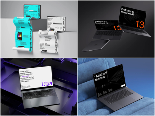
Scroll through any curated Behance gallery and you’ll notice a pattern almost immediately: the strongest UI and web design shots rarely show a bare screenshot. Instead, the interface sits inside a laptop, angled just enough to catch a soft studio light, resting on a desk or floating against a clean gradient. That’s not decoration — it’s strategy. On platforms where attention spans last seconds, presentation is the difference between a project that gets noticed and one that scrolls by unseen.
The First Seven Seconds
Behance and Dribbble are visual marketplaces. Recruiters, art directors, and potential clients browse hundreds of thumbnails in a single sitting, and most decisions about whether to click into a project happen almost instantly. A flat screenshot pasted onto a white background reads as unfinished, even if the actual UI design behind it is excellent. A well-placed laptop mockup signals professionalism before a single pixel of the interface has even been evaluated.
This is why so many top-ranked shots on both platforms follow a similar formula:
- A device
- Realistic lighting
- A believable environment
- Just enough negative space to let the screen content breathe
It’s a visual shorthand that says “this is a finished, real-world product,” not a work-in-progress crop.
From Flat Screens to Believable Context
Human perception doesn’t process a flat rectangle of pixels the same way it processes an object in space. A bare screenshot asks the brain to do extra work — to imagine scale, imagine a hand on a trackpad, imagine the thing actually existing outside a browser tab. A laptop mockup removes that cognitive step entirely. The moment a screen is placed inside a recognizable device, the viewer’s brain fills in the rest automatically: a desk, a workspace, a real person who might use this product tomorrow.
This is essentially the same psychological trick used in product photography — nobody sells a watch as a flat drawing of its face.
Context builds implicit trust, and trust is exactly what a portfolio is trying to earn in the first few seconds of a glance.
Placing a design inside a Laptop mockup taps into this instinct: screen bezels, subtle reflections, and realistic perspective don’t just look nicer — they signal “finished and real” rather than “concept and unfinished,” which is precisely the emotional read a viewer forms before consciously judging the design itself.
Consistency Across a Multi-Shot Case Study
On Dribbble especially, projects rarely live as a single image — they’re shown as a scrollable sequence of shots. Using the same laptop mockup style across that entire sequence creates a visual signature that makes a portfolio instantly recognizable, even in a crowded feed.
Viewers subconsciously associate consistent framing with careful, deliberate work. Switching mockup styles mid-project, by contrast, can make even strong design feel disjointed or rushed. This is why many designers pick one mockup family early and stick with it for the whole case study — treating the frame itself as part of their personal brand.
How to Make Your Design Actually “Land” on Behance and Dribbble
This isn’t theoretical. Walk through any well-performing case study and you’ll see mockups doing very specific jobs:
- Portfolio covers. Many designers use a laptop mockup as the hero image of a case study — the first thing a visitor sees before scrolling further.
- Before/after comparisons. UX redesign projects often place the “old” and “new” interface side by side, each inside identical laptop frames, so the visual upgrade is obvious at a glance.
- App and SaaS presentations. Product designers showcase dashboards, admin panels, or web apps inside a laptop to simulate the real usage environment a client would actually see.
- Agency pitch decks. Studios frequently reuse the same mockup style across multiple client projects to keep a consistent, branded presentation format.
- Social proof shots. Freelancers post laptop-mockup renders on LinkedIn and Twitter/X to promote finished Behance projects, since a styled image performs better in feeds than a plain link.
None of this requires custom 3D rendering skills. Most designers pull from an established mockup library, drop their screen design into a smart layer, and adjust lighting or background to match the rest of their presentation — a process that takes minutes rather than hours.
How to Pick a Mockup That’ll Actually Blow Up on Social
Not every mockup fits every project, and this is where a lot of less experienced portfolios lose points. A glossy, high-contrast studio shot might overpower a minimalist fintech dashboard, while a soft, matte desk scene might undersell a bold, colorful consumer app.
A few practical considerations designers weigh before picking a frame:
- Does the lighting direction match the rest of the case study’s photography or illustration style?
- Is the laptop angle steep enough to distort the screen content, or flat enough to keep the UI fully legible?
- Does the background color compete with the interface’s own palette?
- Does the mockup’s resolution hold up at full size, or will it pixelate once uploaded to a high-res gallery view?
- Is the frame reused often enough across the platform that it risks feeling generic next to more distinctive presentations?
Studios like ls.graphics have built entire libraries around solving exactly this problem — offering multiple angles, lighting setups, and environments so designers aren’t stuck reusing the same generic device shot that half of Dribbble has already seen that week. Variety here isn’t vanity; it’s what keeps a portfolio from blending into the visual noise of a crowded feed.
The Presentation Is Part of the Design
It’s easy to think of mockups as a finishing touch, something applied after the “real” design work is done. In practice, on platforms built entirely around first impressions, presentation is part of the product. A brilliant interface, poorly framed, still risks being scrolled past. A solid interface, framed with care inside a realistic laptop scene, earns the extra few seconds of attention needed to actually be evaluated.
That’s the quiet logic behind why laptop mockups have become such a fixture on Behance and Dribbble — not a trend, but a practical answer to a very real problem: how do you make good work look as good as it actually is?